Introduction
These columns on statistics began by describing the field of statistics as using the mathematical laws of probability to deal with data uncertainty [1]. Many statistical tools developed to apply probability do assume that data are drawn from a normally distributed population, in which the probability distribution function, f(x), of a population follows Equation {1}.
where μ is the average of the population and σ is the standard deviation.
One may then ask, how do we assess a population if it does not have a normal distribution? There are methods for conducting statistical analyses on data that are not normal, one of which will be discussed in the next column. Before using these tools, it may be important to determine whether a data set should be modeled as having a normal distribution. This column will describe a few methods for assessing the accuracy of assuming that a given data set follows a normal distribution.
Data Sets
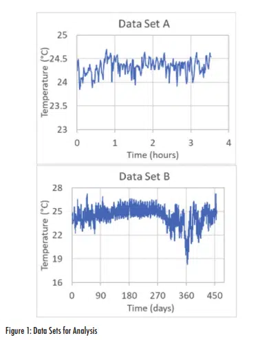
Two somewhat similar data sets will be used to illustrate different methods for assessing normality. These are both measurements of lab ambient temperature that were collected during thermal testing. Data Set A was collected during a material thermal conductivity test that lasted approximately 3.5 hours. Data Set B is the ambient temperatures measured during an extended reliability test that lasted for more than a year. These two data sets are shown in Figure 1.
Both data sets show some variations in temperatures with average values that are nearly the same (24.3 and 24.5°C for A and B respectively). However, there are a few notable differences between the two sets. The range (maximum minus minimum) for Data Set A (<1°C) is much smaller than for Data Set B (~9°C). Given that Data Set B represents data over a time frame that is more than 3,000 times longer than Data Set A, it is not surprising that it exhibits a wider temperature range. Perhaps more importantly, Data Set B has some anomalous behavior, starting around day 300 with particularly low temperatures around day 360. Since this test was started in January, the temperature ‘valley’ around days 300-360 may be associated with the effects of weather – the lab was air-conditioned but has a fume hood to outside air.
Data Comparison
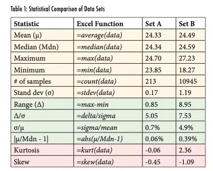
Table 1 shows statistical parameters calculated for the two different data sets. The first six rows in this table (in orange) show parameters that have been discussed in previous articles and should be familiar to the reader. The second column in the table indicates the Excel functions used to calculate the terms. In these functions, the term ‘(data)’ indicates an array that comprises the data set being analyzed. As mentioned, the average values for the two data sets are similar while the variance of B, in terms of the extreme values as well as the standard deviation, is much greater for Data Set B. The second group of results in the table (rows 7-10, in green) shows simple calculations that can provide insight into the characteristics of the distribution. The last two rows (in red) introduce two new functions that help quantify the normality of a data set. The terms in these last two groups are discussed later in this article.
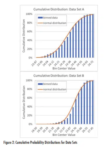
One visual approach for assessing a data set’s distribution is to generate a frequency plot, such as those shown in Figure 2. These were generated by breaking the range of values for each data set into 20 bins (with a bin size of range/20). The number of measurements less than or equal to the value at the center of the bin was divided by the total number of measurements for that data set. These results are plotted for each bin. In addition, the plots show the cumulative normal distribution for each population (calculated using the Excel function ‘=norm.dist(x,μ,σ,true)’, where the bin-center values were used for each x-value).
The two plots show that the cumulative binned data generally match the calculated normal distributions fairly well. Data Set B has a much longer tail than Set A, due to the low-temperature spike seen in the data around day 360. Other than the long tail in the plot for Set B and a few local differences between the heights of some bars and the normal distribution line, the plots in Figure 2 don’t provide any compelling indication that either data set is not normally distributed.
Q-Q Plots
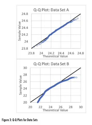
A better approach for comparing the data to a normal distribution is a quantile-quantile (Q-Q) plot. In a Q-Q plot, x-values are determined by first finding the rank (low to high) of each data point and dividing it by the number of samples to estimate a probability. For example, the minimum value of Set A of 23.85°C would have a rank of 1 and the probability for that measurement would then be 1/213 (since the data set was comprised of 213 measurements). The x-value for that data point is calculated by finding the value in a normal distribution corresponding to that probability value. Using the mean and standard deviation for Data Set A (24.33 and 0.17, respectively as shown in Table 1), the x-value corresponding to the minimum term with a rank of 1 would be calculated in Excel as ‘=norm.inv((1/213), 24.33, 0.17)’ = 23.89°C. The y-value would be the actual measured value of 23.85°C. This is done for each measured data point; the resulting Q-Q plots, including reference lines of x=y, are shown in Figure 3.
If a data set had a perfect normal distribution, its Q-Q plot would exactly follow the x=y line. Figure 3 reveals some deviations for both data sets, but the plot for Data Set B does exhibit much larger deviations at the extremes (the lowest and highest values) than Data Set A. While not perfect, the Q-Q plot provides a visual method to assess how well a population conforms to a normal distribution.
Standard Deviation Normalization
Comparing a data set’s standard deviation to its mean and range can roughly indicate how well it conforms to a normal distribution. A general rule of thumb is that 95% of a normal distribution is within 2 standard deviations of the mean (a total range of ±2 = 4 total standard deviations) and 99.7% is within ±3 standard deviations. Assuming that the minimum and maximum values are roughly equal distance from the mean, then it is reasonable to assume that 5% (1-95%) of a normal distribution would have a range/standard deviation (Δ/σ) value of 4 and 0.3% would have Δ/σ of 6. The value of Δ/σ = 5.05 for Data Set A would be expected to occur for ~1% of the data in a normal distribution1 . In comparison, the probability of seeing the Set B result of Δ/σ=7.53 is much smaller at 0.017%. While that value is small, given the large sample size in Set B, this is not necessarily proof that the population is not normal.
The ratio of the standard deviation to average, σ/μ, does not necessarily indicate whether a set of data is normally distributed, but the substantial difference between the two sets (0.7% for Set A and 4.9% for Set B) does indicate that the two populations have different characteristics. Likewise, the difference between the means and medians for the two data sets, as expressed with the term |μ – Mdn|-1, does imply that the two populations are different.
Kurtosis and Skew
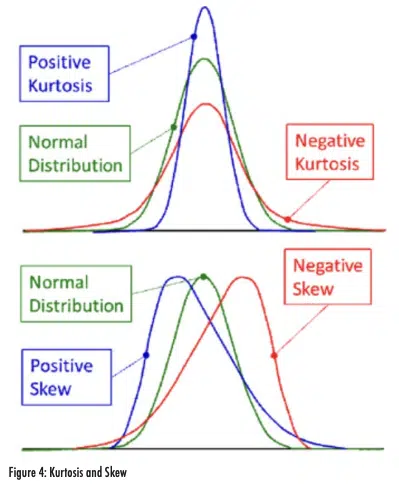
Kurtosis and skew are quantified parameters that help describe how well a given distribution conforms to a normal distribution. As shown in Figure 4, kurtosis indicates whether a distribution is vertically compressed or expanded relative to a normal distribution. A positive kurtosis corresponds to a distribution with very small tails, which leads to more of the population being centered close to the mean. A negative kurtosis has larger tails than expected. Skew indicates an asymmetric distribution that has a larger tail on one side. A distribution with a positive skew is skewed to the right (larger tail on the right) with a mean that is larger than the median. A negative skew has a larger tail on the left and the mean is smaller than the median.
Distributions with ‘excess kurtosis’ with an absolute value in the range of 0-0.5 are reasonably normal. Distributions with an absolute value of skew of 0-0.5 are considered symmetric and normally distributed. Absolute values of skew between 0.5 and 1 are ‘slightly skewed’ and distributions with absolute skew greater than 1 are extremely skewed [2].
For the data considered in this article, Data Set A had kurtosis and skew of -0.06 and -0.45 respectively. With these values, that data set would be considered normally distributed. In comparison, Data Set B had kurtosis and skew values of 2.36 and -1.09 respectively. Both values indicate that these data are not well described with a normal distribution. Specifically, the data have a large tail to the left and a higher fraction of measurements near the average than would be expected for the calculated standard deviation. Both of these results are a result of the cold temperature spike that occurred around Day 360, which increased the calculated standard deviation and also generated a long tail on the left (low temperature) side of the distribution.
Summary
Many statistical analysis tools have been developed using the assumption that data are taken from populations with a normal distribution. In reality, real data are almost never normally distributed but instead only approximate it with varying degrees of success. This article has discussed a few methods for assessing data to determine how close, or far, it deviates from the normal distribution assumption.
If the distribution of a data set substantially differs from normal, alternate statistical analysis approaches may be needed to make assessments. The next article in this series will discuss a method for comparing two data sets to determine whether they are statistically different using an approach that does not assume a normal distribution. This technique is this author’s favorite statistical test, for reasons that will become apparent once it is described.
References
[1] Ross Wilcoxon, “Statistics Corner: Probability”, Electronics Cooling Magazine, Spring 2020, https://www.electronics-cooling.com/wp-content/uploads/2020/03/Electronics-Cooling_ Spring-2020.pdf
[2] Sufana Gawali, “Shape of data: Skewness and Kurtosis”, Analytics Vidhya, https://www.analyticsvidhya.com/blog/2021/05/ shape-of-data-skewness-and-kurtosis/
