Overview
Sometimes, regardless of how carefully we conduct testing to gather data, we end up with results that just seem wrong. This could be a sign that we have stumbled upon an earth-shattering breakthrough that will change the world’s understanding of fundamental physics1 …. or, it’s possible that a mistake in the testing led to bad data. This column will discuss a few examples of ways that testing mistakes that led to the collection of data that didn’t exactly tell the correct story.
One potential source of bad data is if there is a selection bias in the process of collecting data. This occurs when the method of collecting data tends to have a bias that slightly shifts the distribution of the collected data to one side of the normal distribution of the population. Classic examples of this have been seen in political polling conducted with landline telephones: telephone-based polls in 1936 had a bias to more wealthy voters while the same method in 2020 resulted in a bias to older voters. One of the challenges in thermal testing is to ensure that the physics of temperature measurement methods don’t introduce a bias in the results. Thermocouple measurements tend to generally be low, particularly when large thermocouple wires that can act as cooling fins are used. When exposed to long-term high temperatures, thermocouple drift could influence results in testing conducted over long periods of time. Accurate infrared temperature measurements rely on knowing something about the emissivity of the surface being measured – if that emissivity is not uniform or changes over time, bad data can be the result.
While knowledge of basic statistical approaches is important for data analysis, a healthy dose of skepticism is also helpful. Data are collected by human beings, who are known to occasionally make mistakes. When faced with data that look strange, it is a good idea to take the advice of the disembodied TSA voice at the airport: if you see something, say something. The strange results may in fact be accurate – but it is often worth the effort to double-check that the data haven’t been biased by a measurement error.
A few years ago, I was asked to analyze data collected in a study to evaluate the impact of solder voids on the solder joint reliability of ball grid array (BGA) components subjected to thermal cycling. For this testing, 15 test boards were assembled with three different-sized daisy-chain BGA components with different configurations of microvias in the solder pads on the test board. The ‘BGA56’ was a 6mm x 6mm BGA with 56 solder balls on a 0.5mm pitch. Each test board included 4 replicates of the BGA56 with microvias in the test board solder pads (reference designators U1, U11, U15 and U24 correspond to the four locations where they were placed on the circuit board). Further details on the component and test methods are provided in Reference [2].
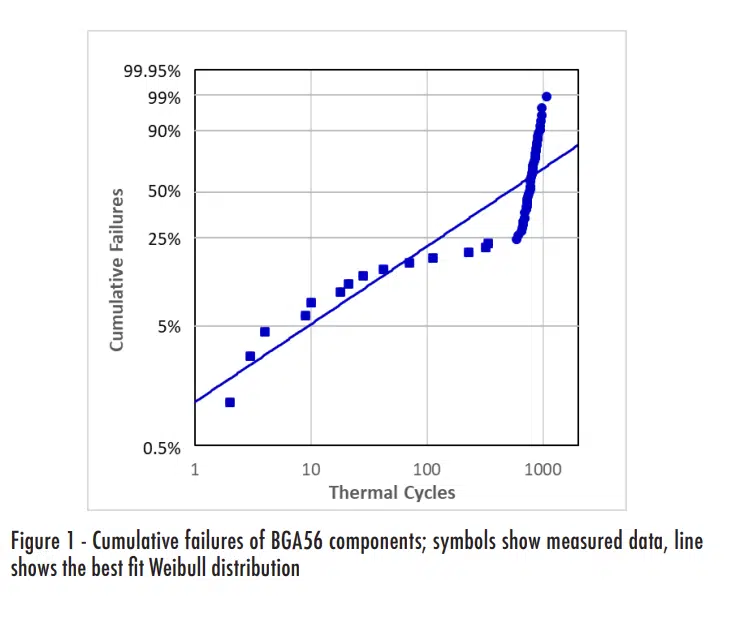
The initial analysis of the test data consisted of calculating the Weibull distributions for each component configuration [3]. When the Weibull distribution was calculated for the previously mentioned BGA56 configuration, the results looked somewhat strange, as shown in Figure 1. When cumulative distribution data appear to ‘bounce’ above and below the best-fit line, as in the figure, it is often the case that the data actually include values from different population characteristics.
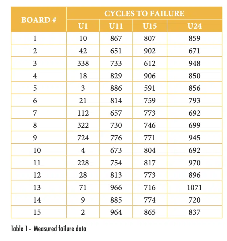
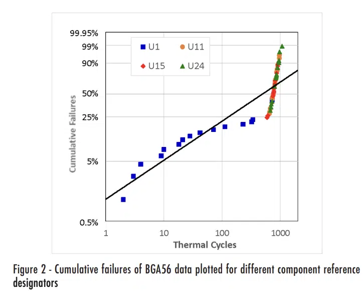
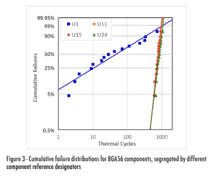
Table 1 shows the measured failure data for the BGA56 components, grouped by the reference designator, while Figure 2 shows the same plot as the previous figure, but with the data for the different reference designators indicated with different symbols.
Simple observation of either the raw or the plotted data should be sufficient to make one suspect that the reliability of the U1 components was substantially different from the others. For quantifiable indications of whether there are differences between U1 and the other components, we could plot individual sets of data for each reference designator, as shown in Figure 3.
In addition, since all the components in consideration failed by the end of testing, we can assume that they followed a roughly normal distribution and compare the means using a t-test [4]. Results of using a t-test to determine the probability that two populations have the same means are summarized in Table 2. Combinations with values less than 5% would typically be considered a statistically significant indication that the populations are different. As shown in this table results from U1 appear to be significantly different from the other components, but there is no statistically significant difference between any of the other combinations; for example, the t-test between U11 and U24 produced a value larger than 5% (of 42.1%).
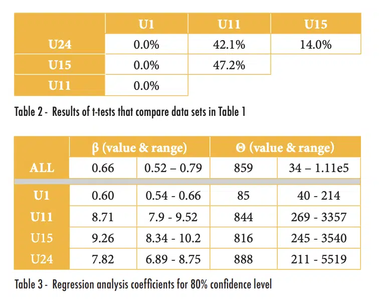
Alternatively, or if all of the components had not failed by the end of testing, we could compare the coefficients for the Weibull distributions of the different populations. Since the coefficients (β and θ, which as a reminder, are similar to the standard deviation and mean of a normal distribution) are calculated using linear regression, we can determine the uncertainty of the values for a given confidence level [5]. The results of this analysis are shown in Table 3; the ‘range’ values indicate the values in which one is 80% confident that the values of β and θ are within. This table shows substantial differences in the calculated coefficients and their ranges for the selected confidence level.
Dedicated readers of this column are invited to review references [3-5] and duplicate the results shown in Table 2 and Table 3.
After it was recognized that there was such a significant difference in the results for the U1 components than the others, efforts were made to determine the source of the difference. Inspections of micrographic cross-sections of failed parts revealed that U1 components consistently had a single solder joint with insufficient solder. Eventually, it was determined that an error had been made in the design of the solder stencil used to apply solder to the test board prior to part placement and solder reflow. This led to no solder paste being applied to the solder pad, which produced a solder joint that was doomed to fail far earlier than it should have. This was an example in which the statistical analysis revealed a problem with the testing approach. Fortunately, because of the nature of thermal cycling to evaluate solder joint reliability, there were ample opportunities to assess the components after the fact and identify the root cause. In other types of testing, it may be difficult to determine a true root cause if the nature of the test does not leave as many ‘bread crumbs’ to determine what happened. That may lead to the need to repeat a test.
Sometimes we don’t have an entire set of data that is questionable, but just one odd result. Can we just throw out the data we don’t like? Well, we probably shouldn’t…. But if data are drawn from a population that truly is a normal distribution, it is certainly possible to occasionally have a measurement that is 4 or 5 (or more) standard deviations from the mean. These types of outliers may be real – but they may not provide a good indication of the true population, particularly if we have only a few measurements. Chauvenet’s Criterion can be used to assess whether a single data point is an outlier and provides a formal method that can justify eliminating a data point that seems to be an outlier [5]. The Chauvenet test statistic, τ, is defined in equation 1:
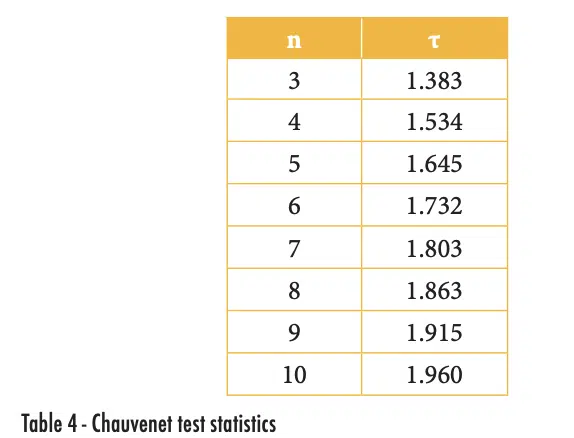
where x is the suspicious value, μ and σ are, respectively, the mean and standard deviation of the population. The value of τ depends on the number of measurements made in the population, as shown in Table 4. The test statics in the table can be calculated with Excel using the function “abs(norm.s.inv(1/(4*n)))”.
To use the Chauvenet Criterion to assess an outlier data point, calculate the mean and standard deviation of the full data set (including any suspected outliers) and then calculate the value of τ as shown in equation 1. If that value is larger than the test statistic shown in Table 4 for the population size, that outlier data point can be removed so that the average and standard deviations can be determined without it.
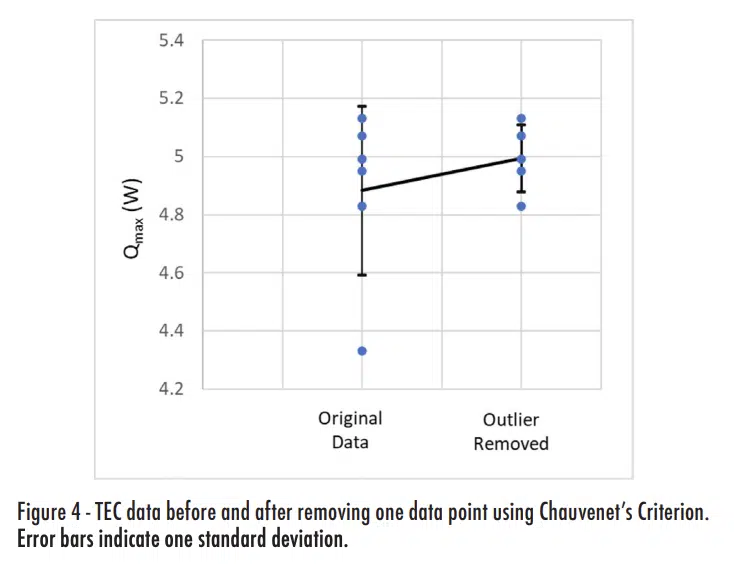
For example, I recently tested thermoelectric cooler (TEC) devices to measure their performance characteristics. This was done with an existing thermal test stand that required that two TECs be tested and averaging the performance of both. As part of this testing, I conducted repeated tests of the same TECs to better understand the measurement variability. The same pair of TECs was tested six times and the average Qmax value, which is the maximum heat that can be input to the TEC while maintaining zero temperature difference on the two sides.
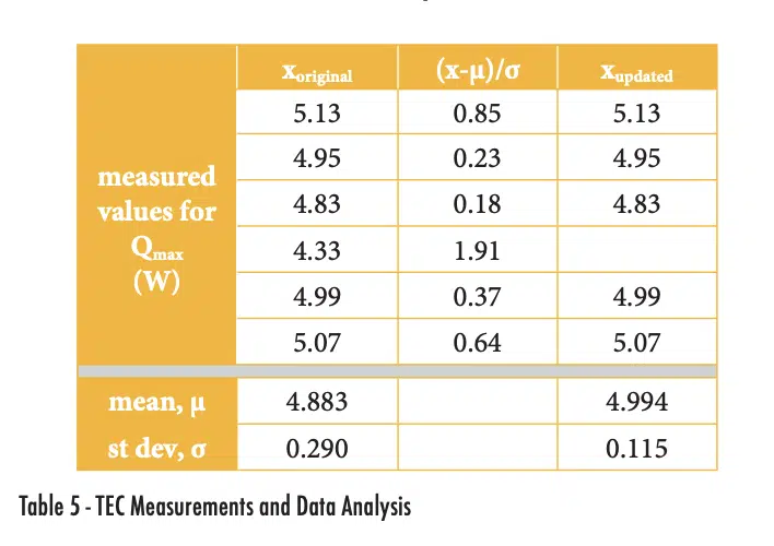
The six measured values for Qmax are shown in the xoriginal column of Table 5, with average and standard deviation values of 4.833 and 0.290. The normalized deviation is calculated by finding the absolute value of the difference between a value and the mean and then normalizing it by the standard deviation. The measurement of 4.33W has a deviation of 1.91, which is larger than the value of τ for n = 6 of 1.732, as shown in Table 4. Therefore, we can use the Chauvenet criterion to eliminate that one data point and assume our data set is that shown in the Xupdated column.
Figure 4 plots the data and shows the impact of applying the Chauvenet Criterion. Eliminating the single outlier actually did not change the average value much (increasing it by 2.3%). The main impact of applying the Chauvenet Criterion was on the standard deviation, which is reduced by more than 60%.
Summary
Statistical analysis is not simply a process of plugging data into a set of equations and reporting the results. It is important that the analyst pays attention to the data to try to detect values that could be problematic and lead to incorrect conclusions. In some cases, a statistical analysis can detect results that do not accurately characterize the true population and help to guide the researchers to review their test approach to identify an experimental error. In other cases, testing may not have left any ‘breadcrumbs’ that can be used to find direct evidence of why a data point is an outlier. As a general rule, data should not be simply discarded because it is inconvenient, but methods such as Chauvenet’s Criterion do at least provide a formal method that can help to justify removing a measurement that excessively increases the measured variance.
References
[1] Dave Hillman, et al. “The last will and testament of the BGA void”, Journal of Surface Mount Technology, July-Sept 2012, Vol. 25, Is. 3, pp. 29 – 41
[2] Ross Wilcoxon, “Statistics Corner: Weibull Distribution”, Electronics Cooling Magazine, Jan. 2023.
[3] Ross Wilcoxon, “Statistics Corner: Comparing Populations”, Electronics Cooling Magazine, Sept. 2023.
[4] Ross Wilcoxon, “Statistics Corner: Regression Analysis”, Electronics Cooling Magazine, Mar. 2022.
[5] J.P. Holman, “Experimental Methods for Engineers, 6th edition”, McGraw-Hill, 1994, pp. 73-75
